Dashboards turn your raw telemetry into visual answers. Use them to monitor equipment health, track KPIs, and spot trends that matter to your operation.
After reading this page, you will be able to:
- Create a new dashboard and add widgets
- Write ClickHouse SQL queries to bind live data to widgets
- Configure visual thresholds (color ranges) for gauges and charts
- Export and import dashboards between environments
How Dashboards Work
Dashboards in Proxus are query-driven. Each widget runs a ClickHouse SQL query and refreshes on a configurable interval (or manually). This means dashboards display periodic snapshots of your data, not a continuous real-time stream.
If you need real-time system health with live scores and recommended actions, use the Operations Center. Dashboards are best for analytical views — trends, aggregates, and KPI tracking over time.
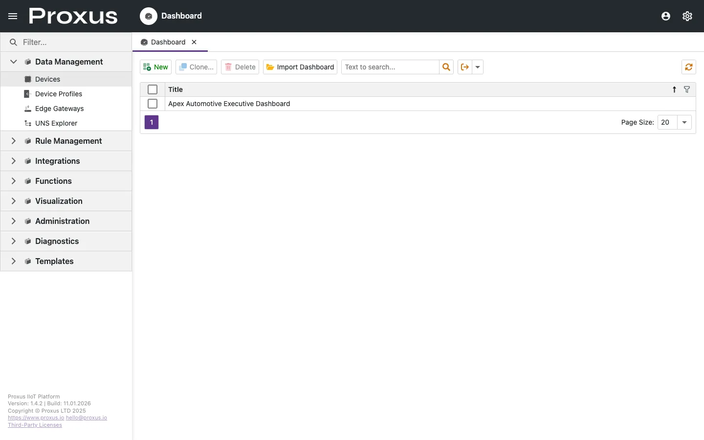
Creating Your First Dashboard
Open the dashboard list
Navigate to Visualization > Dashboards and click New Dashboard. Give it a descriptive name like "Production Line Monitor."
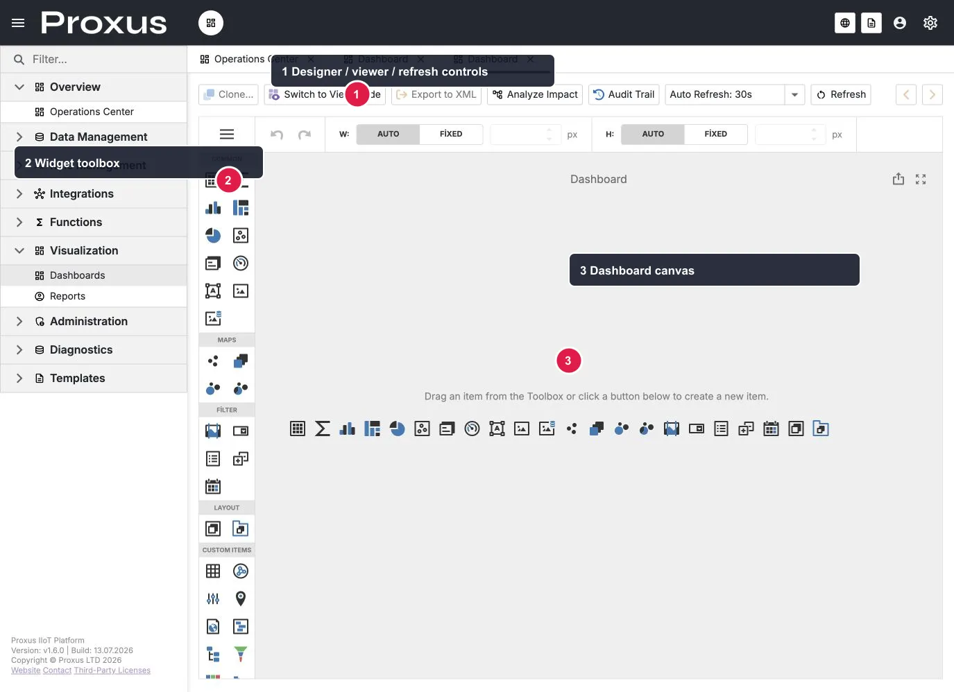
The local English demo was verified on the live Dashboard Designer. The numbered markers show the designer/viewer and refresh controls (1), the widget toolbox (2), and the dashboard canvas (3). Creating a dashboard opens an empty designer; save the dashboard before sharing or exporting it.
Add a Gauge widget
Drag a Gauge from the widget toolbox onto the canvas. This will show a single value — perfect for current Temperature or Speed.
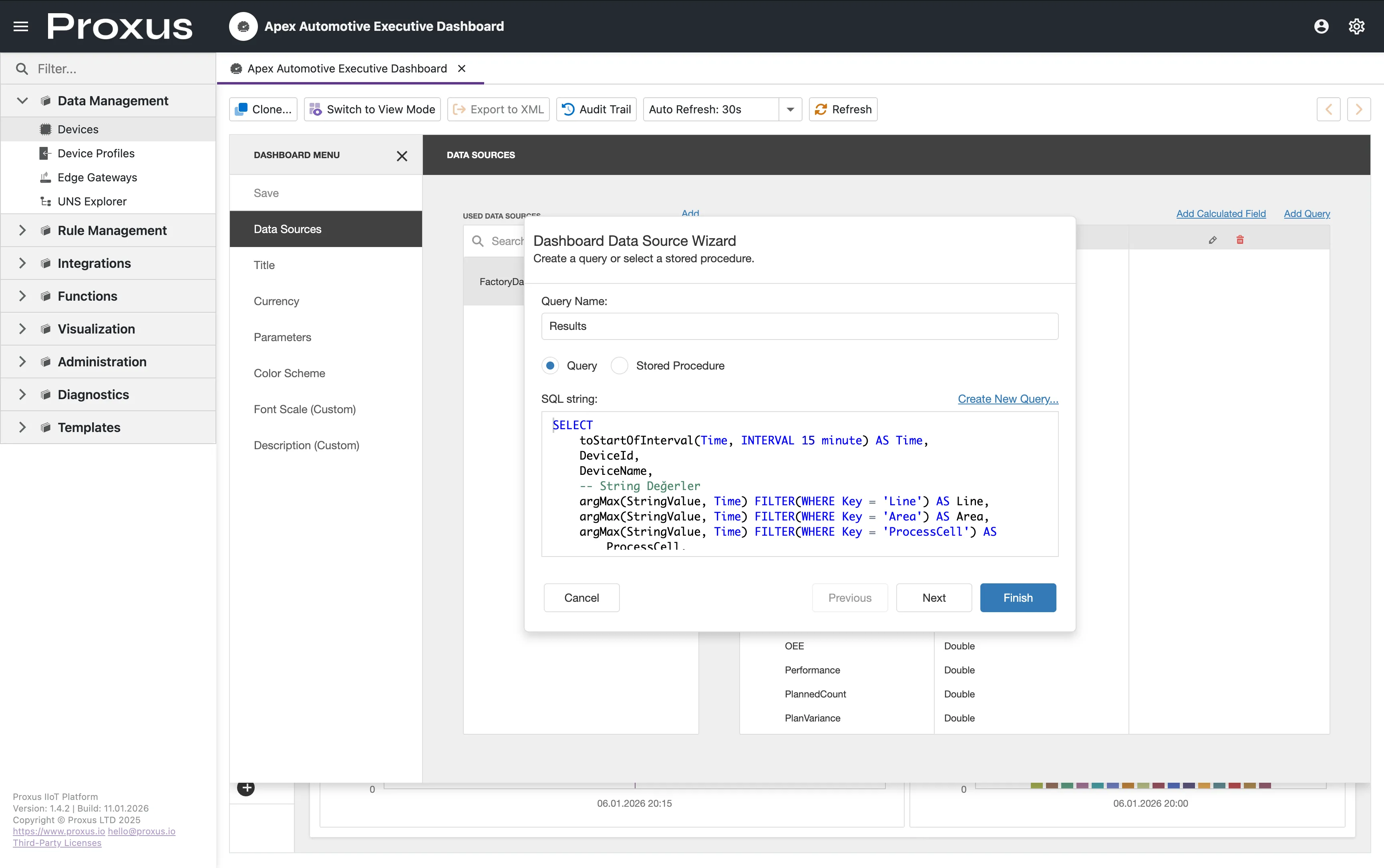
Write the data query
Click the Gauge to open its properties panel. Under Data Source, select New SQL Query and enter:
SELECT
  avg(NumericValue) as Temperature
FROM DeviceRawData
WHERE Key = 'Temperature'
  AND DeviceName = 'Gen_01'
  AND Time > now() - INTERVAL 5 MINUTE
This query calculates the average Temperature from the last 5 minutes. If you followed the Quick Start guide, replace Gen_01 with the device name you created.
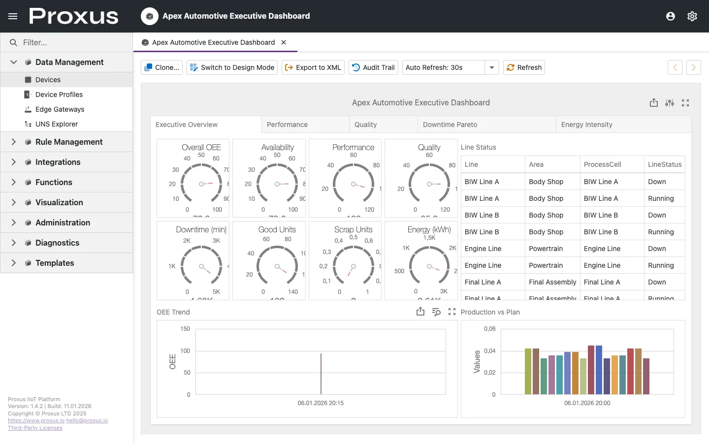
Configure the appearance
Set the gauge properties:
- Min:
20 - Max:
80 - Label:
Temperature (°C)
Add color ranges so operators can spot problems at a glance:
- Green: 20-50 (normal operating range)
- Yellow: 50-65 (elevated, monitor closely)
- Red: 65-80 (critical, take action)
Set auto-refresh
In the dashboard toolbar, set Auto-Refresh to 10 seconds. The gauge will re-run the SQL query at this interval.
Widget Types
| Widget | Best For | Data Shape |
|---|---|---|
| Gauge | Single current value (Temperature, Speed, OEE) | One row, one column |
| Chart | Trends over time (Line, Bar, Area) | Multiple rows, time column |
| Grid | Tabular data, alarm lists, raw values | Multiple rows, multiple columns |
| Map | Geo-spatial view for distributed assets | Rows with lat/long columns |
| State Indicator | Binary status LED (Online/Offline, Running/Stopped) | One row, boolean or threshold column |
Useful ClickHouse Queries
These queries work with the default DeviceRawData table.
Average value per hour
SELECT
  toStartOfHour(Time) as Hour,
  avg(NumericValue) as AvgTemperature
FROM DeviceRawData
WHERE Key = 'Temperature'
  AND DeviceName = 'Gen_01'
  AND Time > now() - INTERVAL 24 HOUR
GROUP BY Hour
ORDER BY Hour
Min / Max over a period
SELECT
  min(NumericValue) as MinTemp,
  max(NumericValue) as MaxTemp,
  avg(NumericValue) as AvgTemp
FROM DeviceRawData
WHERE Key = 'Temperature'
  AND Time > now() - INTERVAL 1 HOUR
Device reading count per day
SELECT
  toDate(Time) as Day,
  DeviceName,
  count() as ReadingCount
FROM DeviceRawData
WHERE Time > now() - INTERVAL 7 DAY
GROUP BY Day, DeviceName
ORDER BY Day DESC, ReadingCount DESC
Downtime detection (no readings for 10+ minutes)
SELECT
  DeviceName,
  max(Time) as LastReading,
  dateDiff('minute', max(Time), now()) as MinutesSinceLastReading
FROM DeviceRawData
GROUP BY DeviceName
HAVING MinutesSinceLastReading > 10
ORDER BY MinutesSinceLastReading DESCYou can write and test queries in the Data Query Studio before using them in dashboards. This gives you a faster feedback loop.
Binding Options
Select Widget
Click on the widget (e.g., a Gauge) to open its properties panel.
Choose Query Source
- New SQL Query: Write a ClickHouse SQL query directly.
- Saved Query: Reuse a query created in Data Query Studio.
- Calculated Field: Add derived columns (e.g.,
oee = good_units / total_units).
Configure Appearance
Set min/max limits, color ranges (e.g., red if > 100), and labels.
Sharing Dashboards Between Environments
Dashboards are stored as XML definitions. You can export and import them to share between environments (e.g., Dev → Staging → Production).
To export: Open a dashboard, click the Export button in the toolbar.
To import: In the dashboard list, click Import and select the XML file.
Exported dashboards include SQL queries that reference device and tag names. Make sure the target environment has matching device names, or edit the queries after import.
Common Issues and Solutions
| Problem | Likely Cause | Solution |
|---|---|---|
| Widget shows "No Data" | SQL query returns empty results | Check device name, tag name, and time range in your query. Verify data exists in Data Query Studio. |
| Dashboard is slow | Complex queries or short refresh interval | Increase refresh interval, add LIMIT to queries, or aggregate at the hour/day level instead of raw rows. |
| Values look stale | Auto-refresh is off or interval too long | Check the refresh setting in the dashboard toolbar. |
| Gauge shows wrong range | Min/Max not configured | Set appropriate min/max values in widget properties. |
For more detailed troubleshooting, see Dashboard Issues.
Customize dashboard chart colors, export restrictions, and rendering engine via the UI & Themes section in Proxus-config.toml.