Use the Operations Center when you need to understand what is happening now and what needs action next. It brings system health, data flow, and connectivity issues into one place across your unified namespace.
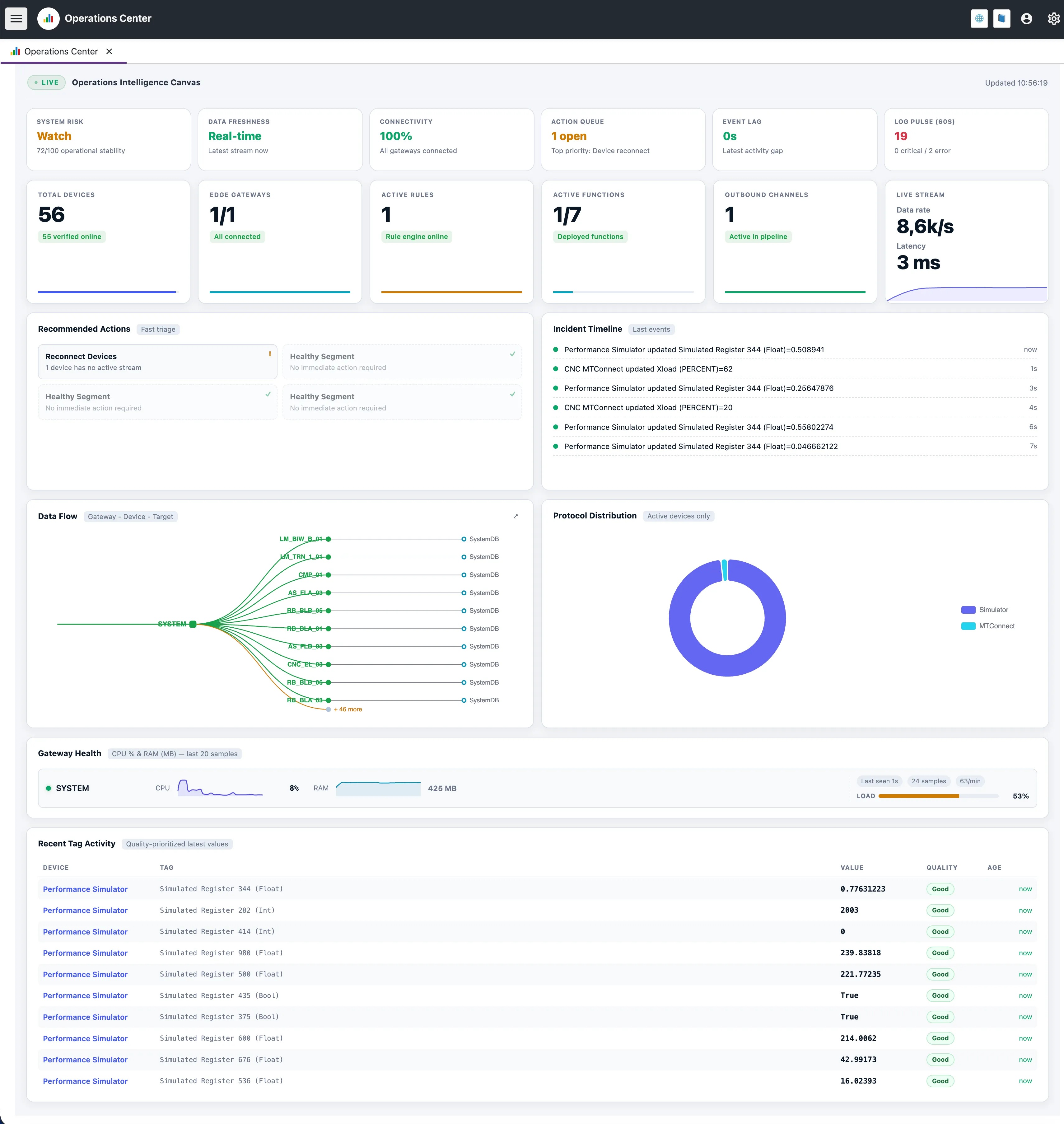
Unlike a static dashboard, the Operations Center stays context-aware. It keeps checking platform metrics and suggests actions before small issues become failures.
Signal Insights
At the top of the page, the Signal Row gives a quick summary of system stability. Each card is interactive: click it to see the score, the main risk factors, and what to do next.
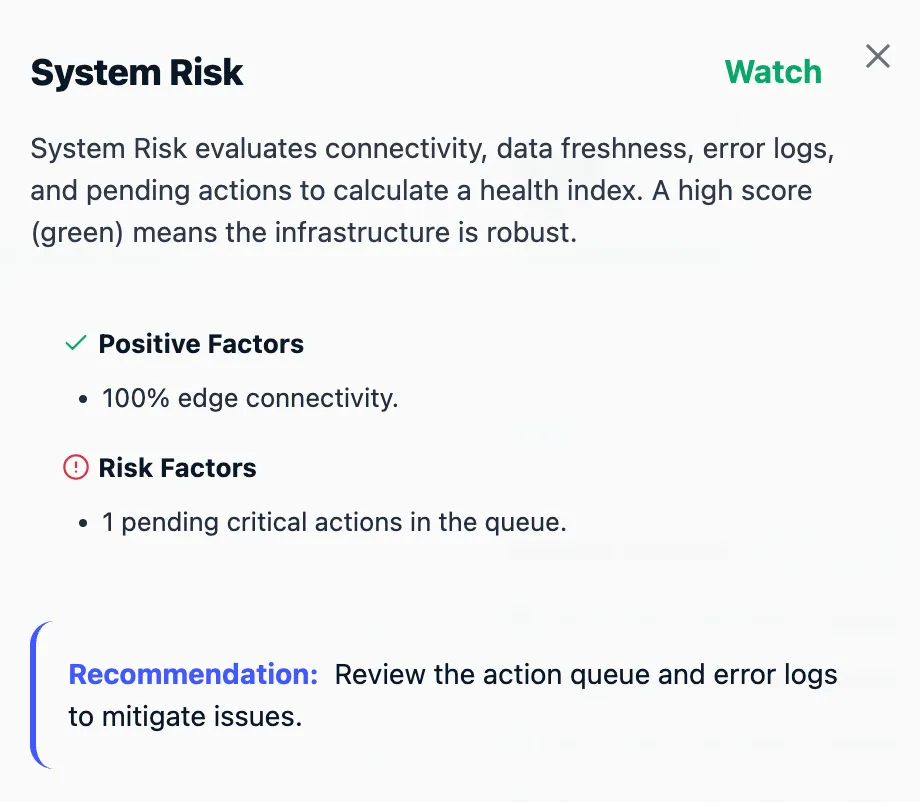
System Risk
A score that combines error logs, connectivity, and data freshness.
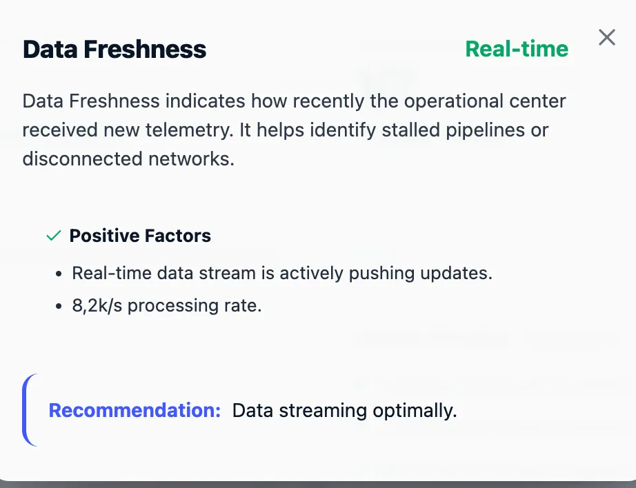
Data Freshness
Shows how long it takes for the newest tag updates to reach the core.
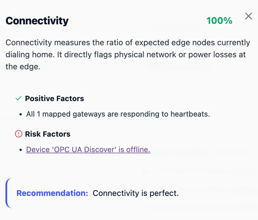
Connectivity
Shows how many configured gateways and devices are online.
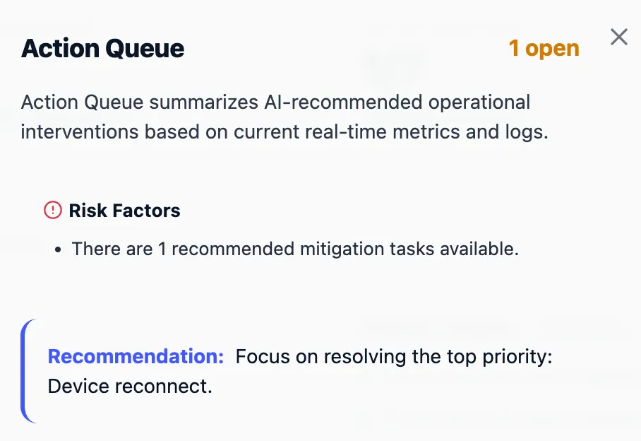
Action Queue
Shows the actions that are most likely to restore system health.
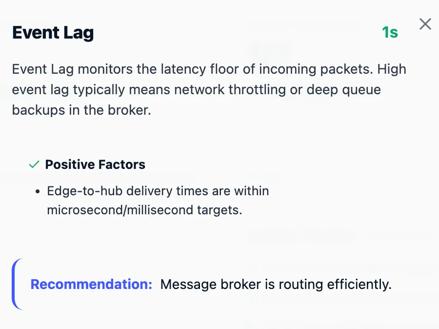
Event Lag
Tracks how long incoming packets take to move through the platform.
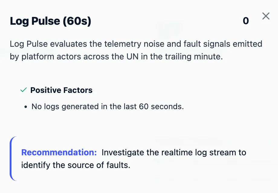
Log Pulse (60s)
Summarizes the volume and severity of logs from the last minute.
System Risk Insight
When system risk drops to a problematic level, this view shows which gateways or components are affected and how to respond.
Data Freshness Insight
Shows where edge data is slowing down on its way to the core.
Connectivity Insight
Shows which gateways and devices are missing heartbeats.
Action Queue Insight
Sorts recommended interventions by priority. Instead of raw logs, operators see the next useful action.
Event Lag Insight
Shows network behavior when data transmission becomes unstable.
Log Pulse Insight
A categorized 60-second summary of platform logs that separates critical faults from routine warnings.
Key Performance Indicators (KPIs)
Below the signal row, the KPI cards offer a numerical breakdown of active platform components:
- Total Devices: Shows how many configured devices are online. - Edge Gateways: Tracks the connection status of distributed gateways. - Active Rules & Functions: Confirms the status of the automation logic and custom edge scripts. - Outbound Channels: Shows how many integrations are sending data out.
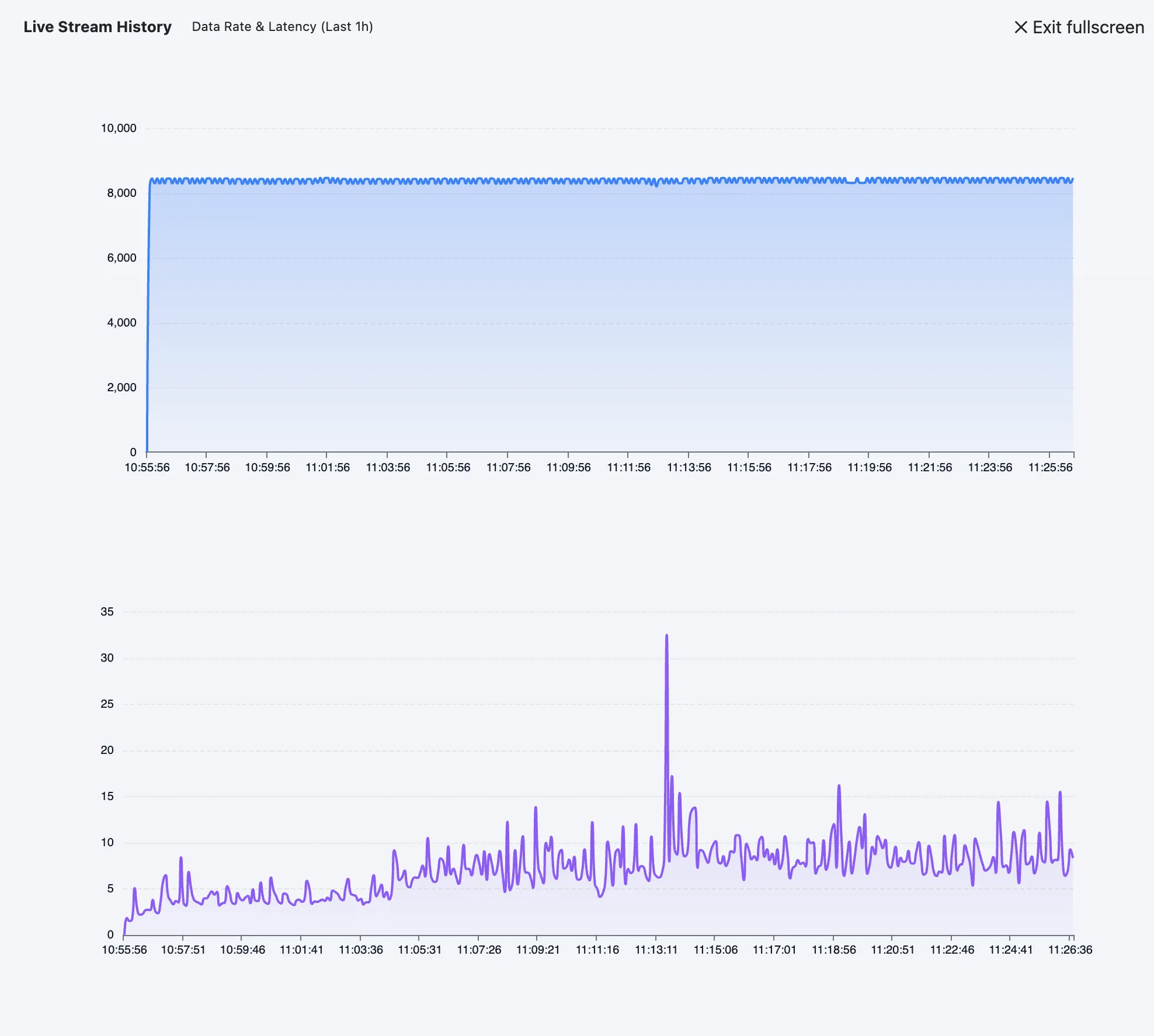
Live Stream Monitoring
The Live Stream card shows the current throughput of the platform, including message rate and average pipeline latency. Click it to open the last hour’s performance chart.
Recommended Actions & Incident Timeline
The Recommended Actions panel suggests next steps. Instead of searching through logs to find why a device stopped sending data, the platform analyzes state and offers one-click actions.
- Recover Gateway: Checks disconnected gateways with a dedicated ping sequence.
- Reconnect Devices: Looks for inactive device streams in the transport pipeline.
- Inspect Pipeline Delay: Finds tags that have gone stale in the processing queue.
The Incident Timeline shows recent system events, state changes, and value updates in order.
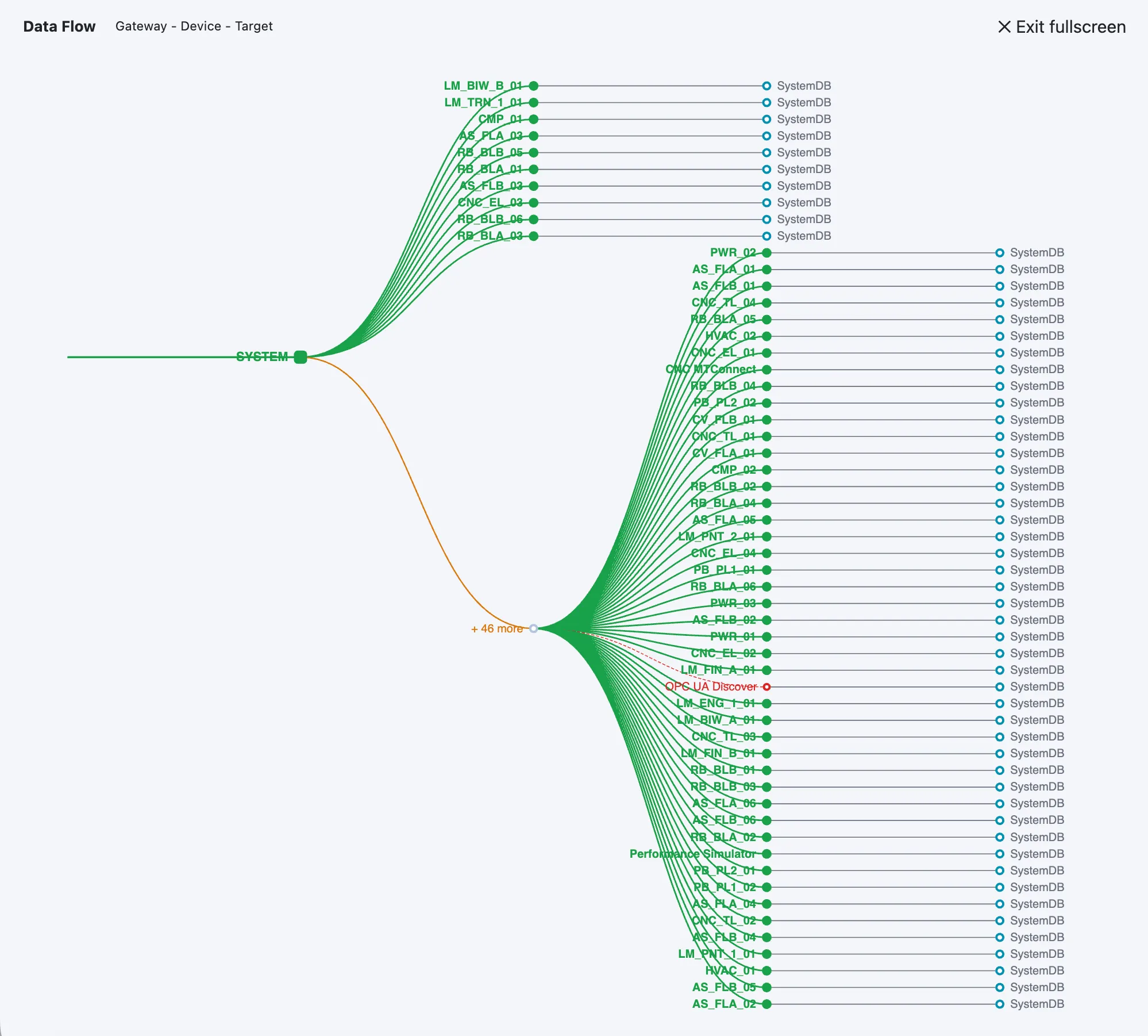
Data Flow Topology
Understanding how data moves from edge to core helps explain where delays or failures appear. The Data Flow section visualizes the active pipeline using an interactive Sankey diagram/tree.
It maps the route data takes from Gateways → Devices → Outbound Targets (such as System Databases, MQTT brokers, or Cloud Analytics). You can expand this view to full-screen for larger deployments.
Gateway Health & Tag Activity
To give deeper visibility without leaving the management console, the bottom sections show hardware performance and live telemetry:
Gateway Health
Displays the last 20 CPU and RAM samples for every connected gateway. It also calculates a weighted "Load" percentage and tracks how often metrics update so edge hardware is not overwhelmed.
Recent Tag Activity
A constantly updating list of the latest telemetry across the unified namespace. The table is ordered by Data Quality so operators can spot sensor failures or protocol mapping errors quickly.